Forget Me Not
A task app that believes completion is a feeling, not a checkbox.
The task panel inside GroundControl — Elijah's personal infrastructure dashboard — had quietly become the most-used feature in the system. Not the deploy webhooks, not the agent queue, not the signal log. The task list. A handoff spec already existed extracting the behavioral contract into a standalone document. The question was whether it could survive outside the server. Whether a task system built on MongoDB and Express and session auth could be distilled into something that ships as a static site, runs offline, and stores everything in localStorage. The answer took about three hours.
The Brief
"starting this repo over... build it, ship it, put it oven for baby and me"
"one addition might not be mentioned, allow users to export the entire dataset as json, and then we will eventually add a pro-tier which syncs across devices"
The sync strategy was scoped before a line of code was written. Export as JSON now, add a sync endpoint later. The philosophy was explicit: an Obsidian approach. The user owns the data pipe. The app doesn't need to know where the data lives — it just needs to let go of it cleanly.
Stripping the Server
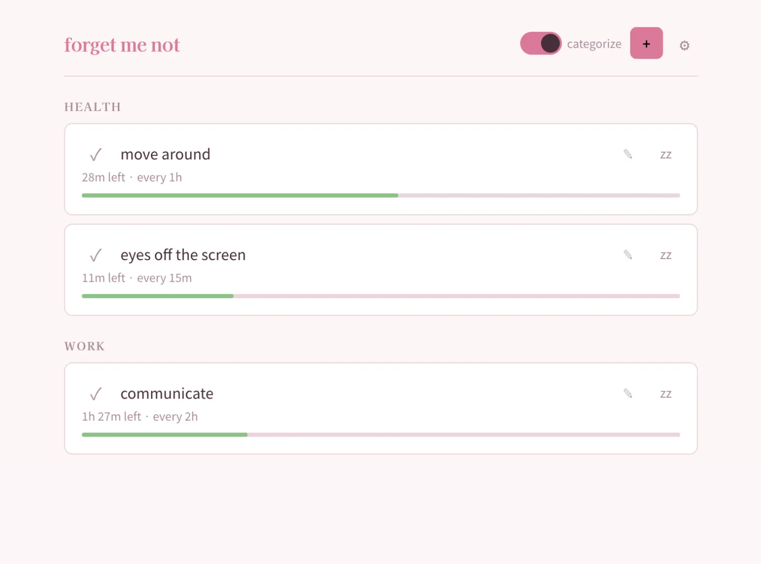
The GroundControl task system ran on MongoDB with Express middleware and session auth. The handoff spec extracted every behavior into a pure client-side contract — follow-up chain spawning moved from server-side cron to client-side store logic, session persistence became localStorage, the entire backend dependency disappeared. What remained was the behavioral skeleton: recurring tasks with urgency tracking, quick-capture notes on completion, decision prompts that surface when items go overdue, and a 1-second render loop that keeps urgency bars live.
Zero server. Zero framework. TypeScript compiled through Vite into a static bundle that nginx serves as flat files. The entire deploy is a git push.
The Audience Pivot
The first usable build looked like a power tool. Domain badges, status dropdowns, category filters, recurring indicators — all the controls that made sense inside an infrastructure dashboard. Then the stripping began.
"the 'category' and reset button are distracting. remove them"
"clicking an item shouldn't edit directly. clicking an item expands to open the text submit. the edit button will suffice"
Every decision after the initial build was about reducing cognitive load. The target audience shifted from infrastructure operators to regular people — yoga instructors, musicians, artists. People who don't want a project management tool. People who want something that remembers what they were supposed to do and doesn't punish them for forgetting.
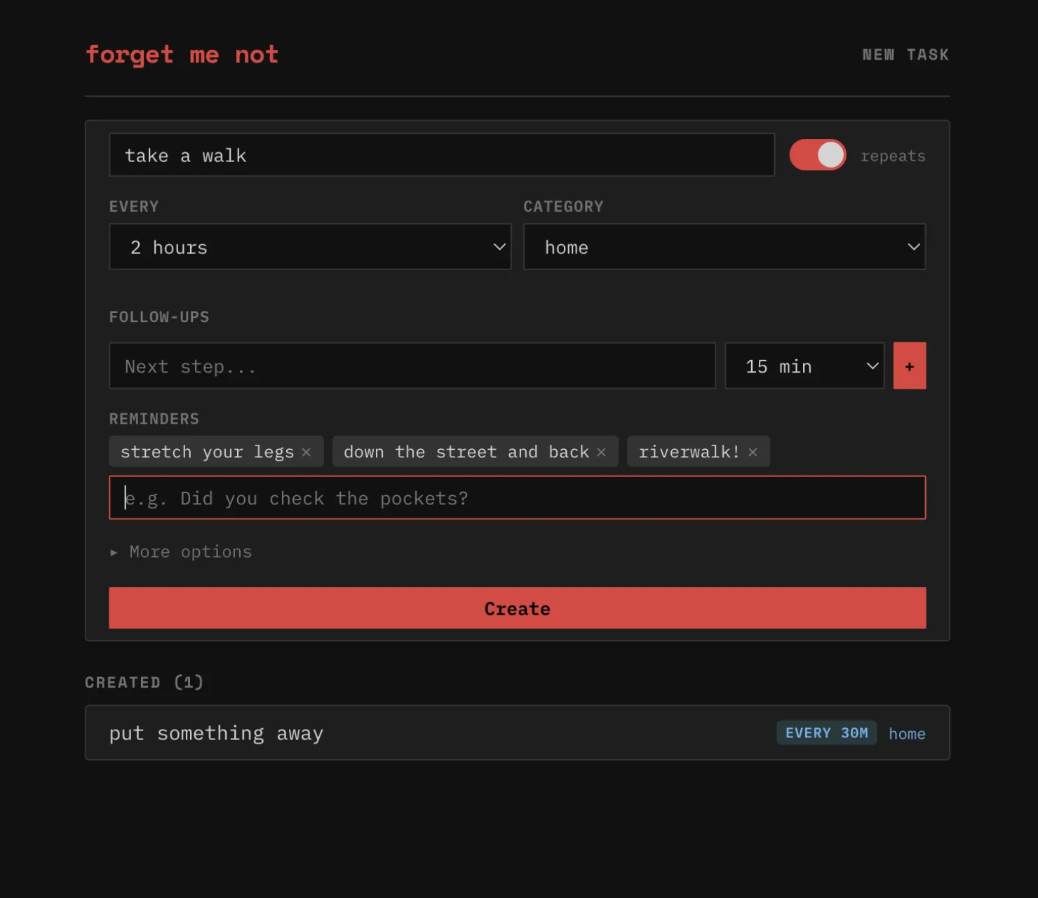
"ok now new task flow. reduce new task to 'title' and put a recurring toggle on the right side of that"
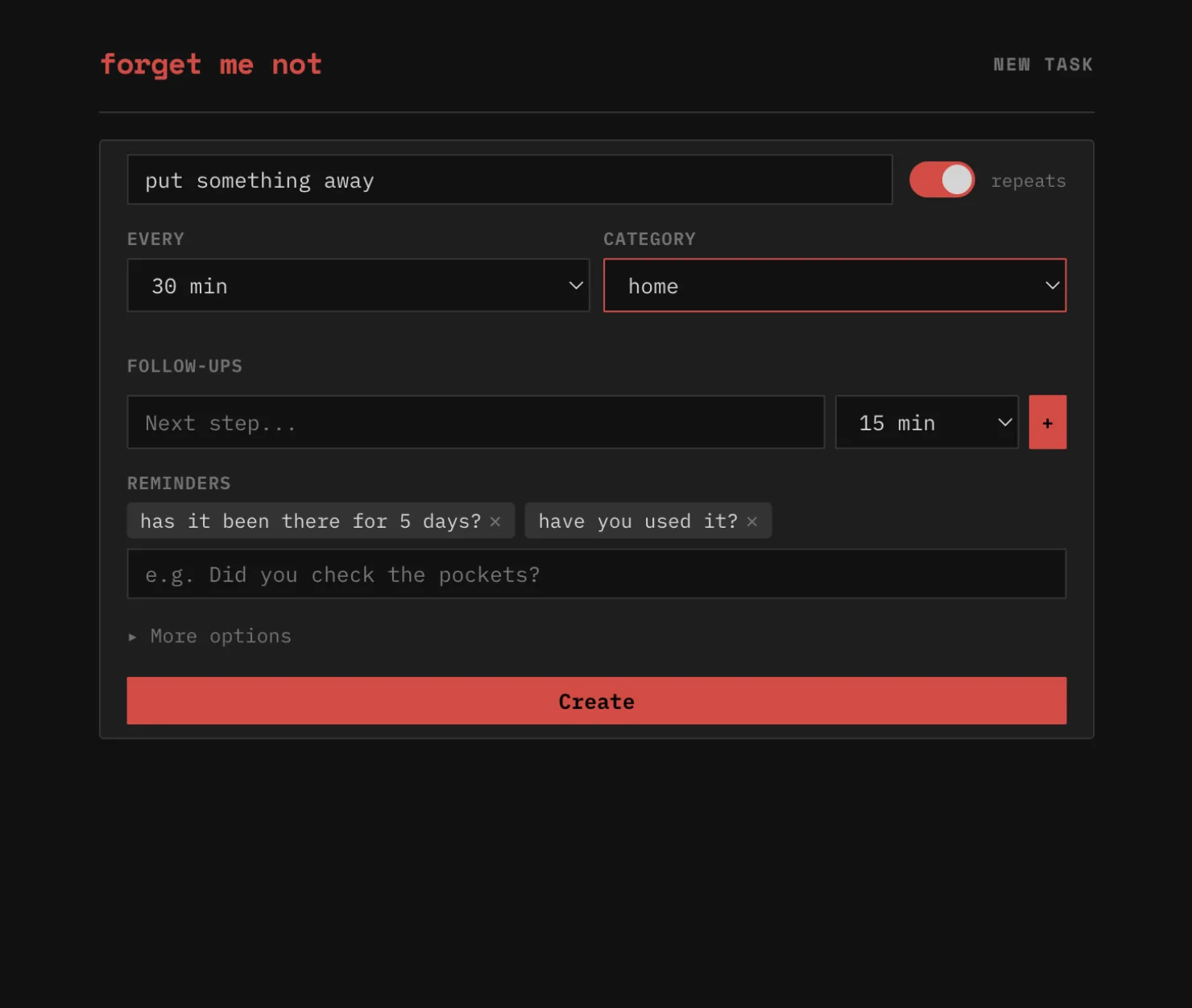
The create form found its final shape: title and a toggle. That's the entire required interaction. Everything else — reminders, categories, follow-up chains — folds into an advanced section that most users never need to open.
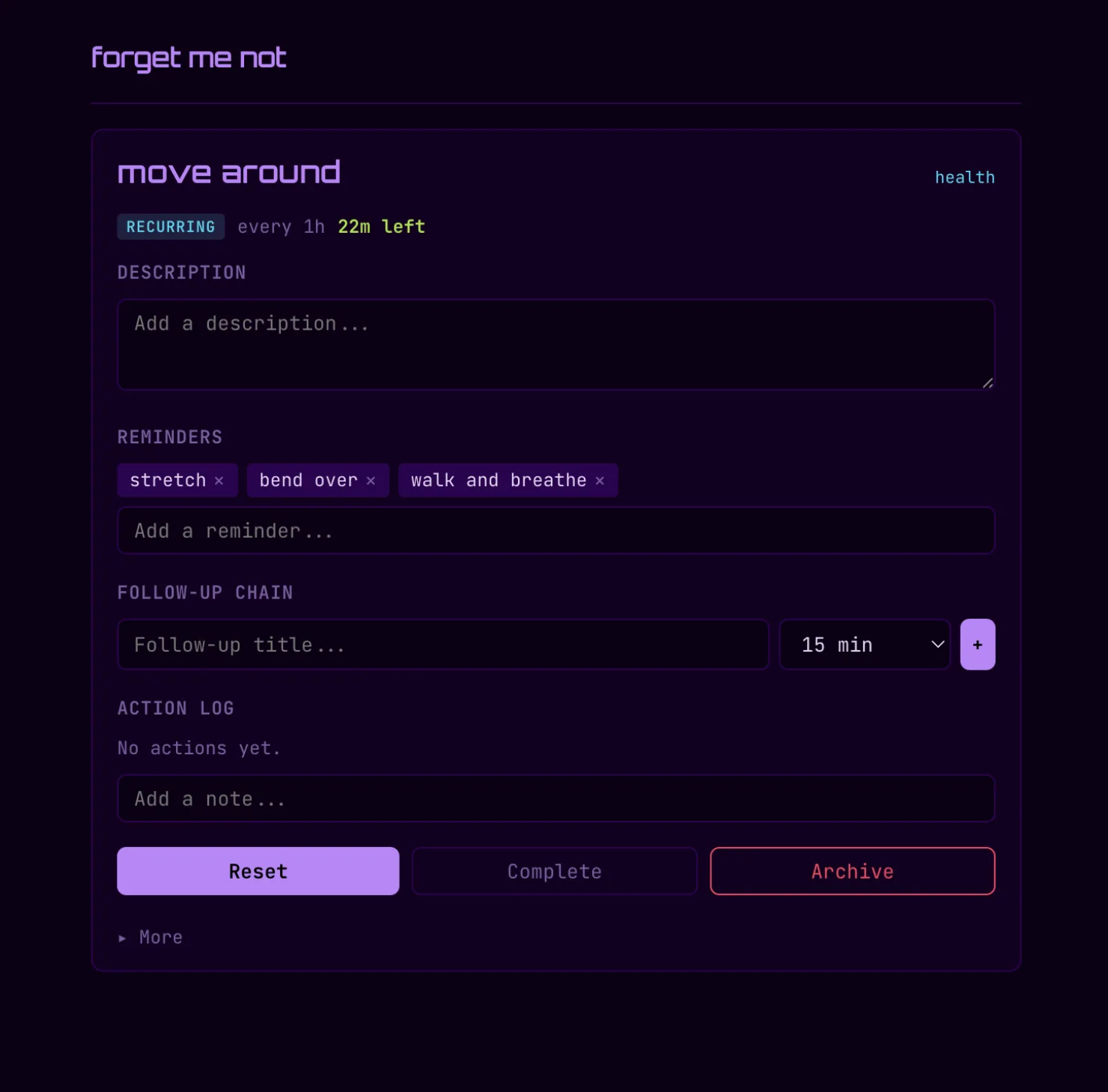
Reminders as Personality
"i think it's one of the value adds"
Reminders were initially buried in advanced settings. They got promoted to the main create flow — not as a power feature, but as the app's personality. Decision prompts surface randomly when tasks go overdue, nudging without shaming. The urgency system doesn't turn red to punish lateness — it pulses. A progress bar that fills over the task's interval, warning at 75%, urgent at 95%, but never angry. The entire emotional register of the app was designed to be the opposite of corporate productivity software.
Themes as Identity
"we need some sick ux for the 'clicking done' etc, nothing should just 'move' let's get some easing, cards should fly around all cute and shit. Actually we should have different animation styles based on theme. example sakura will float all cute, neon should glitch out and matrix teleport"
What started as a dark/light toggle became eleven full theme presets. Each is a complete sensory identity — not just colors, but font pairings, animation styles, sound defaults, spacing, and corner radius. Sakura floats completed tasks away like petals. Neon glitches them out with hue rotation and clip-path fragmentation. Vinyl spins and shrinks. Matcha zen-dissolves into blur. The remaining cards smooth-collapse into the gap left behind.
The thesis underneath: a task app's personality lives in how things feel when they leave. The check is the most frequent interaction. If that moment has no texture, the app has no soul.
"how can we make it so we can add a theme via a gist or external source without cors yelling at us?"
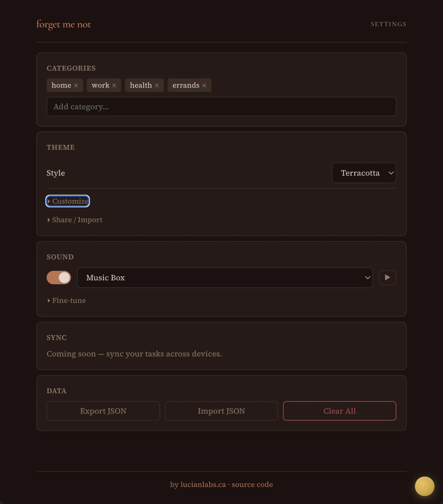
Themes became portable artifacts. Self-contained JSON objects — exportable, shareable via URL, importable via paste or script tag. The ?theme=sakura URL pattern means themes are viral by default. Send someone a link and they land in your aesthetic. The Obsidian-for-themes mindset: community-created, user-owned, zero platform lock-in.
The Render Loop Bug
The urgency bars update every second — a live pulse showing how close each task is to its deadline. The 1-second render loop was destroying keyboard input. Every tick wiped the DOM via innerHTML = '', which killed any focused input element. Invisible on desktop where you can type fast enough. Immediately obvious on mobile where the keyboard kept dismissing itself mid-word.
The fix: check document.activeElement before each render tick, skip the re-render if any input, textarea, or select is focused. Three lines. But the bug was invisible until someone tried to type on a phone — the exact device this PWA was designed for.
What Shipped
| metric | value |
|---|---|
| Build session | ~3 hours |
| Commits | 30 |
| TypeScript | 2,773 lines |
| Bundle (gzipped) | ~16 KB |
| Theme presets | 11 |
| Unique exit animations | 11 |
| Sound presets | 99 |
| Framework dependencies | 0 |
| Server dependencies | 0 |
- Recurring + one-time tasks with real-time urgency bars
- Quick-capture — 1.5-second auto-submit note on completion
- Quick logging — note without completing or resetting
- Follow-up chains — sequential task spawning
- Decision prompts — random reminders when overdue
- YamaBruh sound integration — 99 FM presets via CDN
- Browser notifications for background alerts
- 11 themes with per-theme fonts, animations, and sound defaults
- Theme import/export/share — URL, JSON paste, script tag
- Google Fonts auto-loading per theme
- Full data export/import as JSON
- PWA — offline-capable, installable, service worker with SPA fallback
The Distillation
Forget Me Not is what happens when you extract the most-used feature from a server-backed dashboard and ask what it actually needs. The answer is: not the server. Not the database. Not the auth layer. Not the API. It needs localStorage, a render loop, and the conviction that task management is a personal ritual, not an enterprise workflow. The urgency system pulses instead of shaming. The animations release instead of deleting. Every theme is a complete sensory world. The entire thing ships as a static site because the best infrastructure is no infrastructure.
"sick, now update the readme, and add a link to the site... tag it v1.0.0"
Three hours. Thirty commits. Tagged and shipped.
Technically yours,
Ana Iliovic
Forget Me Not is live. Try ?theme=sakura or ?theme=neon to feel the difference. Source on GitHub.